Personal Branding
This is me. No decoration, no distraction, no noise.
What I needed was a mark that would speak before I do, something that carries my name, my initials, and my way of working in a single glance. So I chose the most honest approach : a clean, uncompromising sans serif. Because good design does not hide behind style — it communicates.
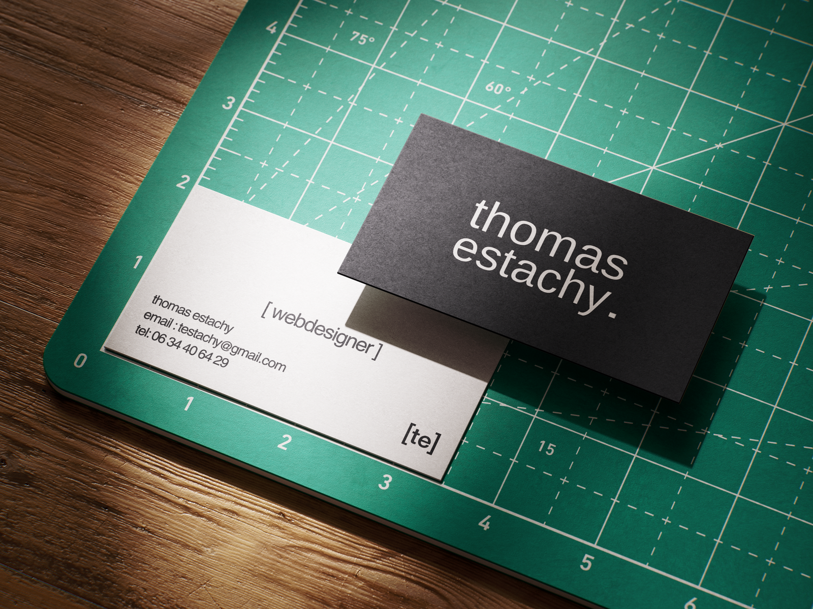
The brackets around [te] are not decorative. They are structural. They frame, they contain, they define, just as a designer should : giving shape to what is undefined, bringing clarity to what is complex. They also reference code, syntax, the logic that runs beneath every interface I build.
Black and white. Not a limitation ; a statement. Contrast is the most radical form of clarity. There is no ambiguity here, no grey area. What you see is exactly what it is.
And the period after my name is intentional. It does not trail off. It stops. Deliberately. Because every project I deliver is complete, considered, and finished with intent.
This identity is not about looking like a designer. It is about being one.
Contact